Modeling the Covid-19 Pandemic using R and Jupyter
- - 📓 Notebook: nbviewer
- - 🔨 Code: github
- The Math Behind the Model
- The Code for the Model
- Visualization
- The Math Behind the Model
- 📓 Notebook: nbviewer
- 🔨 Code: github
Table of contents:
Data science for epidemic investigation and modeling
I recently grew an interest in data science and artificial intelligence, and we are still in a pandemic (although hopefully at the end, fingers crossed for the Delta Variant), so I chose to test out some models to work with data from Covid-19.
Tools used
Here are the tools that I used:
- R: R is a programming language used for statistical computing and graphics. The industry standard in the FLOSS scene.
- covid19.analytics: This is an R package to pull data from the John Hopkins Center for System Science and Engineering (CSSE). This source publishes data with a delay of just one day. Although they changed the structure of the data a few times, it’s very usable and mostly reliable.
- dygraphs: This is another R package that is worth mentioning if you are doing anything in Jupyter (or even in RStudio). Instead of outputting graphs as images, it generates html and javascript graphs.
- Jupyterlab: JupyterLab is a “web-based interactive development environment for Jupyter notebooks, code, and data.”1
My setup
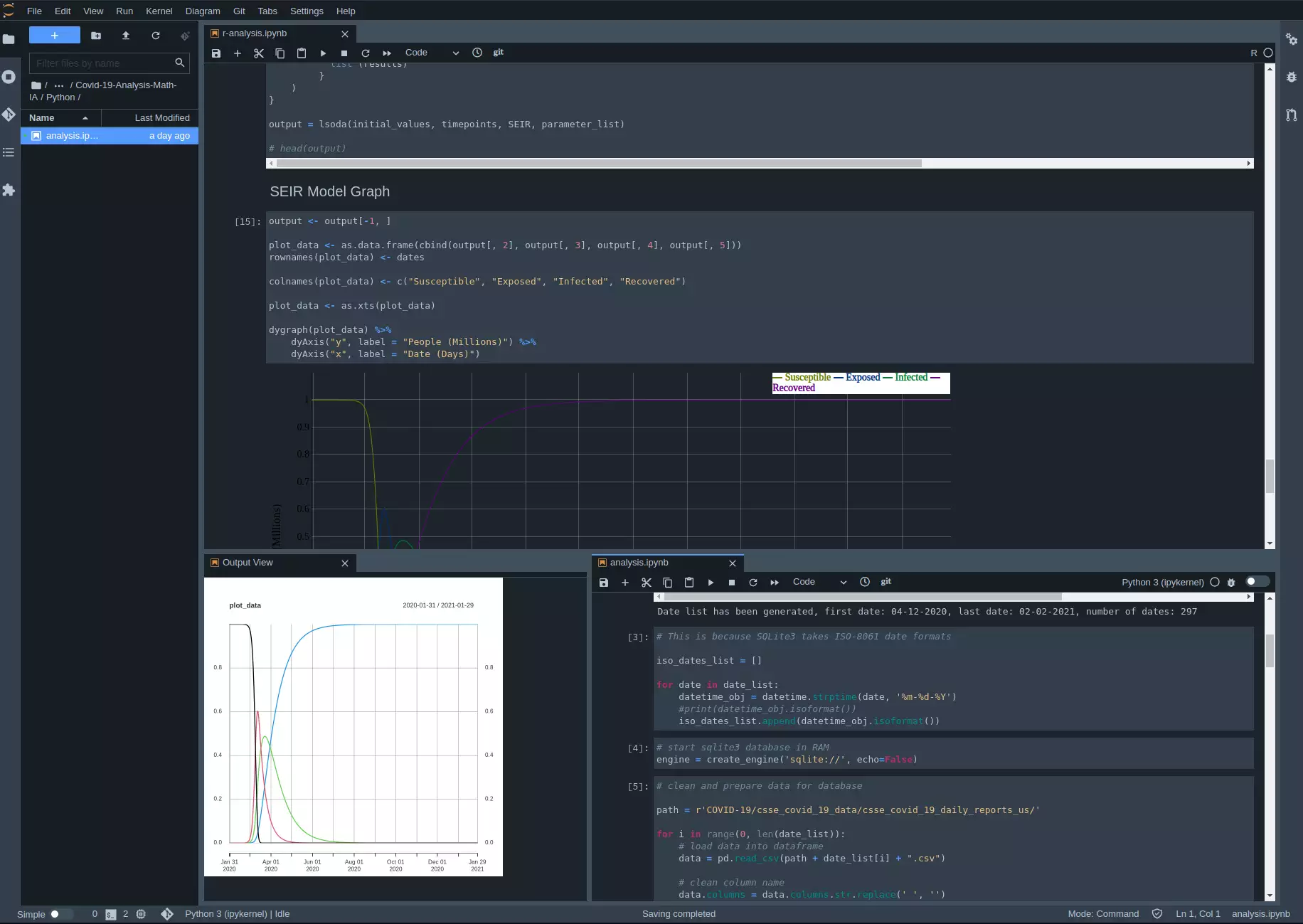
By using those tools I can come up with a setup like this:
The editor
I generally use the light theme for visibility of the graphs, here I used the dark theme because it looks better in screenshots.
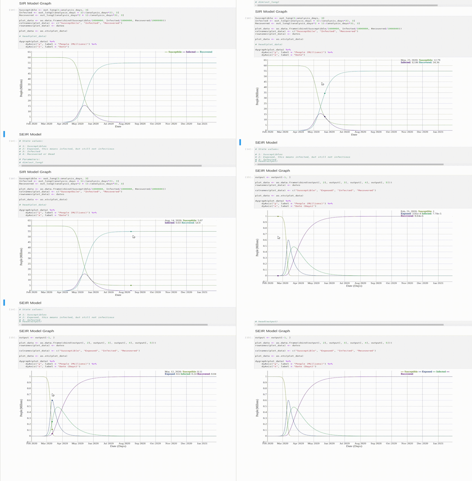
Dynamic graphs with dygraph:
Using this library, we can produce graphs that react depending on cursor events.
Data
The data comes from the Center for Systems Science and Engineering (CSSE) at Johns Hopkins University.
Here’s how the data is structured:

Each row is a country/province, while each column after column 4 is a day. This specific screenshot is taken from the confirmed cases csv file.
We can easily pull this data using the covid19.analysis package described above.
# reads time series data
all_confirmed_cases <- covid19.data("ts-confirmed")
all_confirmed_deaths <- covid19.data("ts-deaths")
all_confirmed_recoveries <- covid19.data("ts-recovered")
Data manipulation
We can easily build a cell to manipulate this data:
indexList <- c()
countryList <- c()

# Get all rows
for (i in rownames(all_confirmed_cases)) {
    # print(c(i, all_confirmed_cases[i, 2]))
    indexList <- c(indexList, i)
    countryList <- c(countryList, all_confirmed_cases[i, 2])
}

country_index_list <- as.data.frame(cbind(indexList, countryList))

country_index_list[154, ]

# We can see that Italy is index 154, so we are going to  use that
italy_index <- 154
After this, we’ll just extract the relevant rows.
it_confirmed_cases <- all_confirmed_cases[italy_index, ]
it_confirmed_deaths <- all_confirmed_deaths[italy_index, ]
it_confirmed_recoveries <- all_confirmed_recoveries[italy_index, ]

print("Cases:")
View(it_confirmed_cases)
print("Deaths:")
View(it_confirmed_deaths)
print("Recoveries:")
View(it_confirmed_recoveries)

firstCaseDate <- "2020-01-31"
We will also need the day of the first case, and we will use that as Day 0 for our models.
# Find index of first case
firstInfection <- 0

for (i in 1:ncol(it_confirmed_cases)) {
    if (class(it_confirmed_cases[, i]) == 'integer' && it_confirmed_cases[, i] >= 1) {
        print(paste0("Index of the first infection is: ", i, ", Number of infections is: ", it_confirmed_cases[, i]))

        firstInfection <- it_confirmed_cases[, i]

        break
    }
}
Analysis
Let’s proceed to analyse this data.
First let’s define some model-agnostic variables, such as the time frame.
# Days that I'm analyzing
analysis_days <- 365

# Date list
dates <- seq(as.Date(firstCaseDate), by = "days", length.out = analysis_days)
Used Models
SIR Model
The SIR is one of the simplest compartmental models used in epidemiology. You can read more about it here, but simply put, the SIR model divides the population in 3 categories:
- Susceptible
- Infected
- Recovered (or dead)
- N = the whole population, \(S + I + R\)
The Math Behind the Model
It can be described by these 3 differential equations, which will show the relations between the Susceptible \(S(t)\), Infected \(I(t)\) and Recovered \(R(t)\) as functions of time.
There are also two parameters, \(\beta\) and \(\gamma\), where beta is the effective transmission rate, and gamma is the effective recovery rate. We can use these two parameters to obtain \(R_0\), which some of you may have heard if you followed the news.
\[R_0 = \frac{\beta}{\gamma}\]The Code for the Model
Now that we know the math behind the model, we can code it in R.
susceptible <- 60e+06 # Source: https://www.statista.com/statistics/786485/population-by-gender-in-italy/#:~:text=Population%20in%20Italy%20in%202020%2C%20by%20gender&text=As%20of%20January%202020%2C%2060.2,roughly%2016%20million%20people%20lived.
infected <- firstInfection
recovered <- 0

initial_state_values = c(S = susceptible, I = infected, R = recovered)

# Parameters
# The beta for covid is estimated to be ranging from 1.5 to 6.68. With median of 2.79. Source: https://www.ncbi.nlm.nih.gov/pmc/articles/PMC7751056/#:~:text=R0%20of%20COVID%2D19,-R0%20of&text=compared%2012%20studies%20published%20from,an%20interquartile%20range%20of%201.16.
# We can simulate this scenario by having our beta as 0.27 and our gamma as 0.1
parameters = c(gamma = 0.1, beta = 0.27)

# Time points
time = seq(from = 1,to = analysis_days, by = 1)

# SIR model function
sir_model <- function(time,state,parameters){
  with(as.list(c(state,parameters)),{
    N = S + I + R
    lambda = beta*(I/N)
    dS =- lambda*S
    dI = lambda*S - gamma*I
    dR = gamma*I

    return(list(c(dS,dI,dR)))
  }
  )
}

#Solving the differential equations
output <- as.data.frame(ode(y = initial_state_values, func = sir_model, parms = parameters, times = time))

out_long = melt(output , id = "time")

colnames(out_long) <- c("Time", "Variable", "Value")
Visualization
And let’s graph the model’s output.
Susceptible <- out_long[1:analysis_days, 3]
Infected <- out_long[(analysis_days + 1):(analysis_days*2), 3]
Recovered <- out_long[(analysis_days*2 + 1):(analysis_days*3), 3]

plot_data <- as.data.frame(cbind(Susceptible/1000000, Infected/1000000, Recovered/1000000))
colnames(plot_data) <- c("Susceptbile", "Infected", "Recovered")
rownames(plot_data) <- dates

plot_data <- as.xts(plot_data)

# head(plot_data)

dygraph(plot_data) %>%
    dyAxis("y", label = "People (Millions)") %>%
    dyAxis("x", label = "Date")
SEIR Model
The SEIR model is an expansion on the SIR model. The E stands for Exposed. An exposed person is a person that was exposed to the virus, but isn’t Infectious yet.
- Exposed: someone who was infected but can’t spread the virus yet.
- N = total population. This time \(N = S + E + I + R\).
The Math Behind the Model
\[\begin{eqnarray} \frac{dS}{dt} & = & - \frac{\beta S I}{N} \\ \frac{dE}{dt} & = & \frac{\beta S i }{N} - \delta E \\ \frac{dI}{dt} & = & \delta E - \gamma I \\ \frac{dR}{dt} & = & \gamma I \\ \end{eqnarray}\]-
From their website: jupyter.org ↩


